For the first anniversary ornament, the client went with her shop's colours, cool aqua and tanzanite; so it made perfect sense to choose something very different, in this case, a brilliant orange and a neon-bright hot pink. —Only problem is, glass doesn't really come in fluorescing pink: in the effetre (104COE) palette I use, the closest thing would be special 0456 gold ruby, so called because the colorant is, in fact, gold.[1]
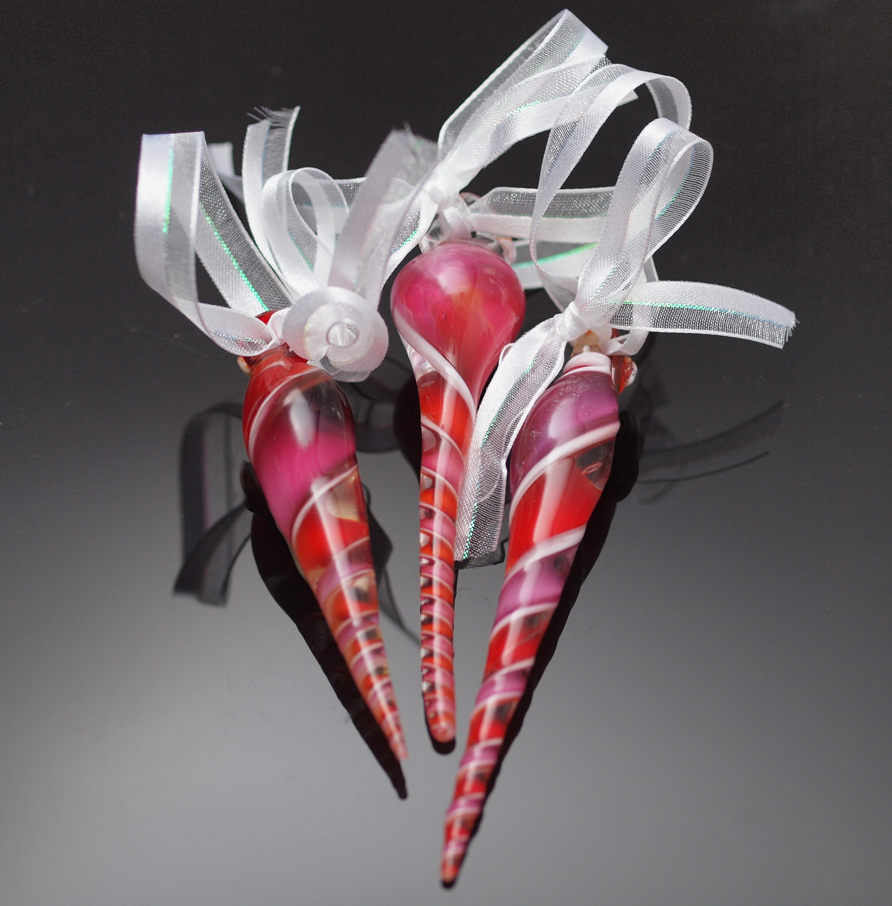
This is a fairly standard jury-style shot of the product
Since we weren't certain this colour scheme would pan out, I also tried a lime green and orange, and cobalt blue and amber, but the orange and pink easily carried the day, not only with the client, but her entire shop's team. One minor difficulty, however is that gold ruby is among the most expensive of effetre colours (only 066 intense black costs more, until you get into limited runs) I had to increase the price a little.
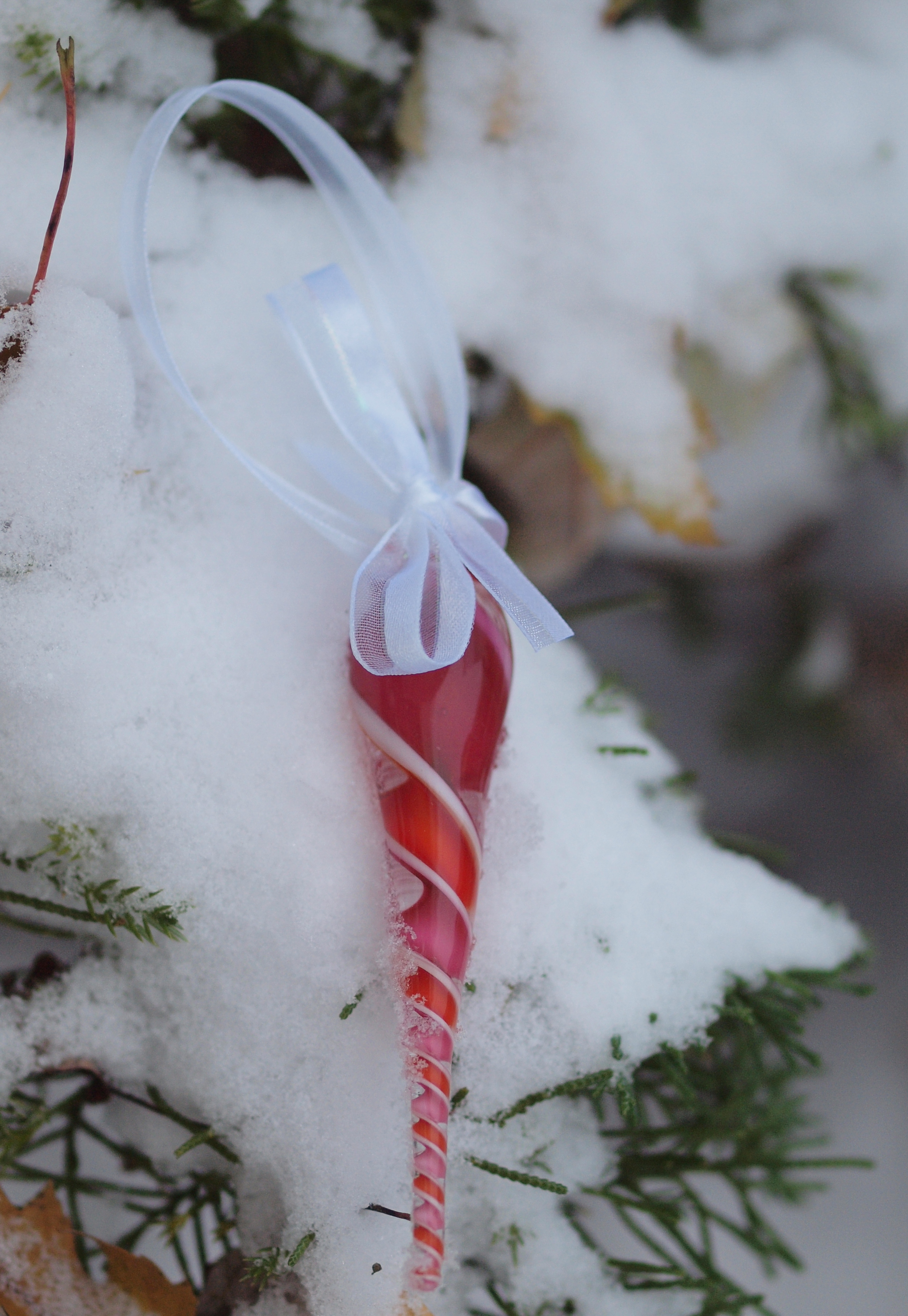
Here's one that takes advantage of the unseasonable 8" worth of snow we got mid-November—a snow covered evergreen is the perfect background for a christmas ornament, right?
Once the colours were chosen I started making the cane; I had some elements left over from last year (including, weirdly enough, a 9) but needed to make a few others. I started with numbers, and my 0 just cracked in half lengthwise. I don't know that I've ever had a cane do that before, but in any case, I took it as a sign from the fates, and decided to do ’19 instead of 2019—it's not like I'm gonna be around in 2119, after all. The cane assembly and pulling went fairly smoothly, helped by the previous year's notes and my decision to pre-heat the pieces to 1150 degrees: I still needed my spouse's help to pull the cane, as my arms simply weren't long enough. One thing I would do in the future is to try and shape the individual elements more as squares (or rectangles) in cross section, as trying to squish glass in those sharp, acute angles without trapping air bubbles is a little tricky.
However, I managed to make the murrina cane without a whopping big air bubble right down the center, so that's progress.
072 orange and 076 red are made, as I understand it, from more or less the same ingredients, but are formulated to strike differently[2] and my orange, except one little rod left over from somewhere or other, was going to a very deep red orange, so I thinned the colour by casing (that is wrapping) it around a clear rod. The pink, on the other hand, needed to be laid down much more thickly for a deep, intense colour. You'll note, looking at the picture, that there's some variation in that as well, with the left most horn being sort of a standard gold ruby; the middle one having more of an orangey cast; and the rightmost a blue-violet cast. None of these are bad, and in fact, Bullseye, famed for its breadth of pinks, has sold all these variations at one time or another. Of course, differing flame chemistry is another way to achieve them, and that's no doubt what happened here.
It's part of what makes glass so endlessly fascinating: depending on how rich (oxygen starved) or how hot the flame[3] , and how long the glass stays in a given set of conditions, some colours can really shift. This drives some artists nuts, but to my mind it's all part of the ‘handmade’ process.
[1]In fact, one way to colour clear colourless glass pink is to lightly fume it with gold; a heavier coating gives you metallic gold finish.
[2]Don't quote me on this; Bandhu Scott Dunham, in discussing striking orange, claims it's a mix of striking yellow and red; I know Frantz was selling some sort of rod that was supposed to shift from yellow to orange to red, depending on how long you struck it; in any event, there are ‘dye lot’ variations in glass.
[3]Or kiln...
Unless otherwise noted, text, image and objects depicted therein copyright 1996--present sylvus tarn.