Er, talk about your potentially awkward titles. Anyway, the CiM folks included about two pages of questions, which after about 6 or 7 I got too lazy to retype (because, remember I'm too much of a luddite to find the .doc file, convert it to a txt or similarly easily read-in-xemacs and then cut and paste). Many of them are interesting but don't apply to my working methods (e.g. the ones involving a lot of heating, marvering, or pressing.)
One of the ones that did interest me was "Hades crawls on regular white but not anice white". I don't work much with opaque base beads, and seldom heat glass enough to cause crawling. But I've always wondered what the difference in anice and standard whites are, and this gave me an excuse to do a simple test on both. But, as I mentioned yesterday, I'm supposed to be testing this stuff on thompson enamels. So for my last set of tests I made base beads on effetre light ivory rolled in TE white (9010, as I recall)—not only to fulfill my mandate, but also to provide another data point, as TE works significantly differently from standard 104 soda-lime opaques. Originally I was going to roll white on white, but that seemed really boring. This proved to be a good decision, because the white TE and the light ivory combined to make a subtle mottled effect I quite liked with the delicate trailing.

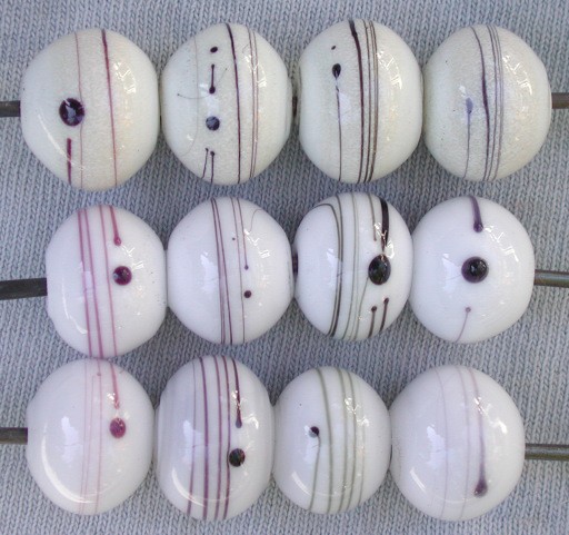
Along the Y axis, from left to right, we have: effetre 064, 066, CiM 0820 hades, and vetrofond 064. Rising along the X axis, from bottom to top, 208 anice white, 204 vetrofond white, and TE white on light effetre ivory.
As you can see, everything spread on the anice white. When I think of crawling, I have more in the mind of James Smircich’ spiderweb beads, or at least the behavior petroleum green and similar colors show. This spread is consistent, but you can see the underlying colors of each black: purple for 064 and 066, a brownish tone for the hades, and a slate blue for the vetrofond.
The stringers are denser on the standard (vetrofond) white I used for the 204 tests. (Why vetrofond? Because Arrow Springs was out of effetre white, and could they substitute? Sure. On the whole I find the vetrofond colors are at least as good as the equivalent effetre glasses, and often better. They just cost a bit more.) The Hades is significantly darker than either the effetre or vetrofond 064s; but not quite as dark as the 066. Presumeably, though, it doesn't cost $60/pound.
So far, so good. Looking at the yellow beads from yesterday the black trailing appears to act more the way it does on anice, rather than standard white, which is something to keep in mind when using hades black on opaques. But what Thompson Enamels, which is what I'm supposed to be testing?
Well, they're almost exactly the opposite of the anice white: really, everything except the standard effetre 064 looks pretty good. Hades holds its opacity quite well. However, it is possible to see the color undertones, which I think of as purple, warm grey/brown, and cool grey/slate blue respectively for the three brands of glass, that is Effetre, Creation is Messy, and Vetrofond. (The CiM folk claim that Hades is a blue-based black, but that some people read it as green. I'd go one step further, and tend to read it as brown. But that can be kind of nice on a warm colored beads, such as these ivory beads, or some others I made in the warm, tertiary brown family, such as several I made on the ASK silver strike series [e.g. carmel apple, cinnomon and rattan, ASK009—011 respectively.)
The conclusion? Well, hades is certainly more dense than standard blacks, if not quite as much as effetre 066 intense black. It's a nice glass to work with (I didn't notice, for example that it was particularly stiff, poppy, etc) and half the price of the intense black (about $30/#, or yeah, I took a minute to look up the price). On the other hand, I use so little on these designs it doesn't really matter how much it costs. So for me the advantage is that it gives me another color of black to work with, a truly warm black to match vetrofond's cool black.
Unless otherwise noted, text, image and objects depicted therein copyright 1996--present sylvus tarn.
Sylvus Tarn