Back in late 2012, CiM sent my friend Cindi B, who was hosting a class, some colors to test. They're pretty luscious:
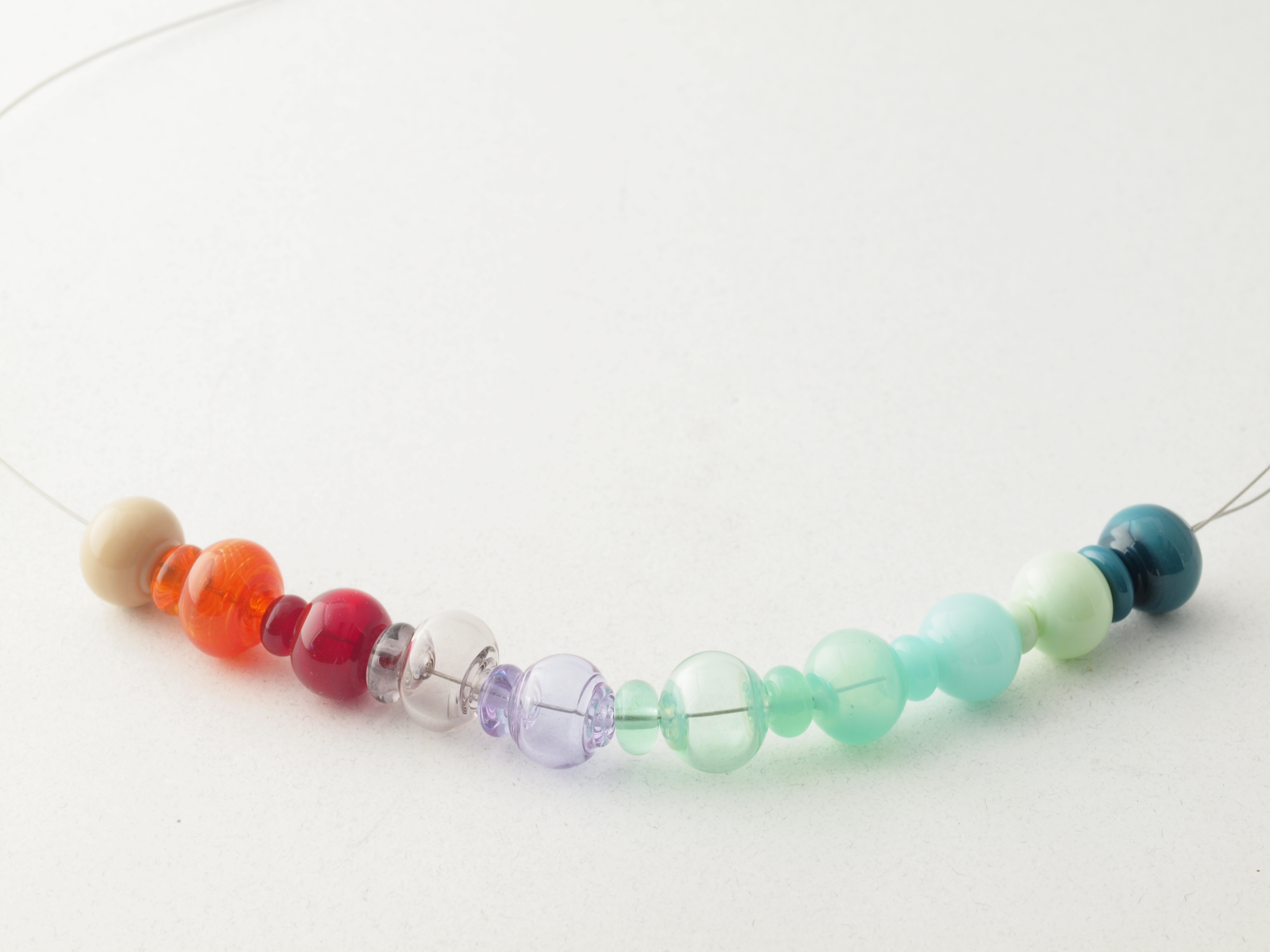
sample strand of CiM colors currently[1] in development. shot 13nov2012. Click for full-size.
Creation is Messy is basically a collaboration between an American and a family owned Chinese factory, and judging from conversations I've had with them over the years, they've worked really hard to maintain compatibility with other 104 coe glasses, particularly Effetre—which since it isn't totally compatible with itself, can be sort of tricky.
As of 2017 (when I finally got around to posting this), my overall opinion of their product is that it makes a great extender to the effetre palette, and moreover, their translucents & socalled ‘moonstones’, such as the rather inaccurately named Halong Bay (which in my experience was green) and Peacock are far safer to use with the transparents and opaques, than Effetre's alabastros or opalinos, which I've long since ‘used up’ and wouldn't even mix with the standard 00/200/400 effetre colours. As to be expected from a smaller firm, CiM costs more, though nothing like the high-silver bearing artisan glasses put out by the likes of DH. Below are my notes, which probably are a bit dated, as I understand the CiM folks are constantly updating their recipes.
Notes (from 2012):
CiM protocol—made 1 spacer (tip of rod) & 1 hollow (~12mm) on 1/16”[mandrel] with high-graphite release; lynx; regalia 10; [tanked] propane. AF99 kiln garaged to 890, 980 1/2 hour soak.
- Q–easy –opq celadon green
- R shampoo caramel opq–shifted to tan w slight pink—easy–slight Ag[2] bearing?
- S dk translucent & easy striking red
- T trans orange difficult & slow to strike–2 attempts[3]
- U blue violet trans
- V unexpected grey/brown cast in artificial [incandescent] light
- W deep, rich green teal, w/ minimal metal sublim[ation] action, (i.e. “sparking”)
- X transparent –> translucent green, but unable to get to opacify w/ control.
- Y & Z 2 v[ery] pretty translucent greens
Overall: all glass behaved well in flame, w/ relatively consistent viscosity & abasence of bubbles, poppiness, stones, etc. However all colors, even transparents, seemed to have ‘greasy’ surface quality. [4]
additional notes: I find U indistinguishable from Count von Count, and W identical to the beautiful blue-green mermaid; so perhaps these are just coming back with new names:) While I could wish that weren't necessary, and I've certainly complained about color names in the past, honesty compels me to admit that I too am much better about retaining color names than stock numbers. Le sigh.
[1]as of 2012, that is, when I started this page...
[2]silver
[3]only 2nd bead is shown; first holepopped while I was attempting to strike it
[4]I noticed this quality in other glass I've used for years, and my eyes have been acting a little weird lately, so I think this is operator (mis)perception, that I happened to notice particularly because I was running tests.)
Unless otherwise noted, text, image and objects depicted therein copyright 1996--present sylvus tarn.