So after Kathy Seamands kindly sent me her company's 104 line to test with thompson enamels, I did what I normally do anytime I get a new glass to work with: made a sample strand. With the 96 stuff I tested last, I added a solid seed bead to the mix , which serves several purposes: one, it uses up the scummy end of the rod; two, it provides me with a solid sample; and three, it makes it easy to tell with which bead a given name tag goes, seeing as it's now sandwiched between two beads of the same color. Provided I actually put the tag between them, of course.
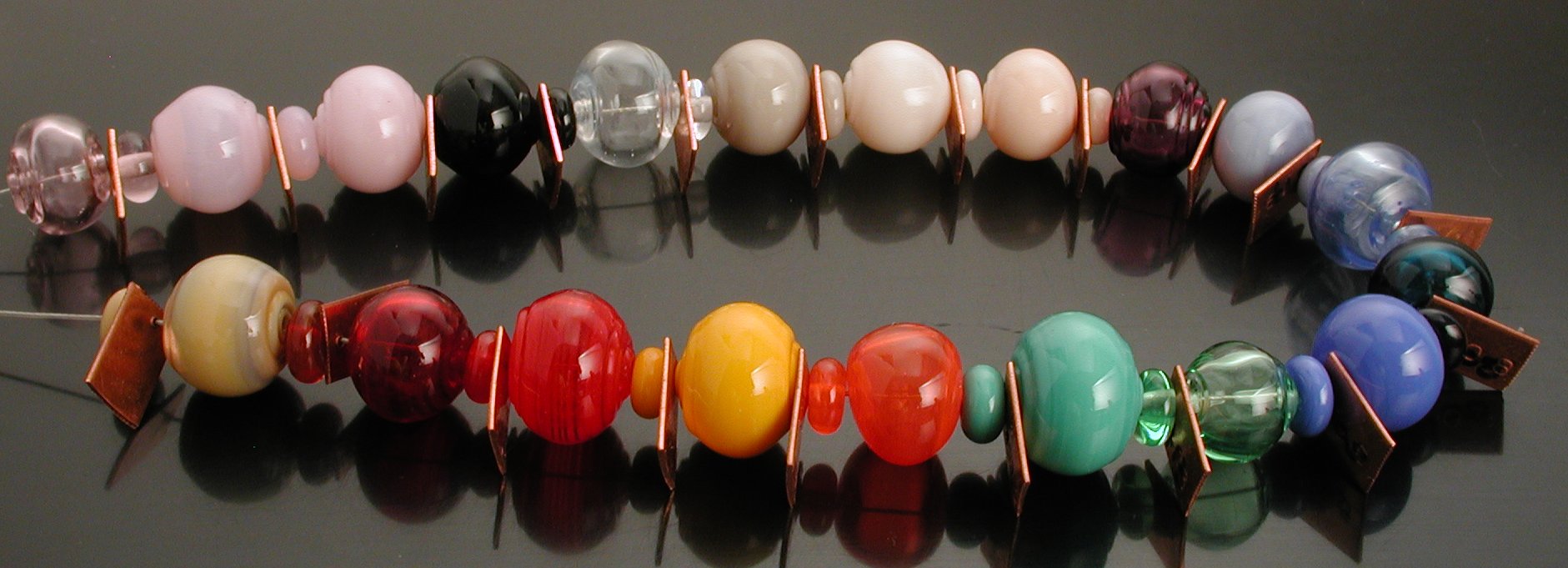
sample strand, September 2007.
Starting with the upper left transparent pink, we have:
- 921rose quartz (translucent)
- 907 Blush (translucent)
- 904 Gelly's Sty (opq)
- 820 Hades (black: technically trans, functionally opq)
- 806 Cirrus (transparent; strikes to translucent)
- 717 Khaki (opaque)
- 703 Butter Pecan (opaque)
- 701 Ginger (opaque)
- 618 Berry (transparent)
- 519 Glacier (opaque)
- 512 Halong Bay (tranlucent)
- 508 Leaky Pen (transparent)
- 505 French Blue (opaque)
- 413 peacock green (translucent)
- 402 Celadon (opaque)
- 229 Pumpkin (opaque)
- 223 Clockwork (transparent, edging to translucent)
- 128 Sangre (transparent, edging to translucent)
- 109 Bordello (transparent)
- 022 Canyon de Chelly (opaque, silver striking)
Now, since I was officially testing this stuff, I actually made a few notes:
701 ginger—*very* poppy; couldn't make bead at all. Worked fine when rod was preheated. Now then, I wish to emphasize that my usual and customary working method is to preheat all rods, except when I'm making pixie dust beads, or some other type of bead in which I can a) continuously hold the rod in the flame and b) allow the bead to air cool without ill effects (ie it is a small, hollow designer bead). It is my opinion that, overall, CiM is of the same or similar quality in terms of poppy-ness/air bubbles with Effetre. It's a fact of life that occasionally you get a bad rod, and I presume that was the experience here.
717 khaki—rod not quite straight; boiled a little.
806 cirrus—no luck getting sample bead to strike.
508 leaky pen—rod boiled a little; maybe needs to be cleaned?
Rod size varied from 4-1/2 – 6-1/2 mm (glacier to khaki) with an average diameter of roughly 5–6 mm, based on my visual inspection.
A note about Gelly's Sty. I was previously given roughly 1/4# of this glass by a friend, and so had already made a sample bead. I felt the scummy surface the glass developed as I worked it was simple boiliness; whereas Seamands claims the problem was devit. Well, I suppose that's entirely possible. I do subscribe to the idea that having conceptual slots (marked by differentiating terms) makes one more aware of differences. Obviously, as a fan of EDP (Effetre's 254, aka Evil Devitrifying Purple) I've experienced devit, but it's been awhile, and perhaps any situation that produced scum goes under the "boil" category in my head. But it did seem to me when I made an earlier batch of beads with the Gelly's Sty pink that it responded favorably to lower temps and a gentler flame. This is on the list of things to explore further.
Ms. Seamands sent me some quite interesting email about the efforts the company has taken with regard to compatibility. When I have a better understanding of these explanations, I'll write a post, but some of this is on their website; and barring evidence to the contrary I'm prepared to believe that the glass is in fact completely compatible with Effetre (and thus Vetrofond), for a value of "completely compatible" that includes, among other things, warnings not to encase opaque Effetre reds with clear, or indiscriminately mix alabastros and opalinos in the 0xx, 2xx and 4xx glasses, etc. IOW, I strongly suspect there is no such thing as "perfectly compatible".
The manufacturer takes requests for colors, and you can practically track the various beadmaking disciplines through the palette—the translucents, rose quartz, halong, and peacock (and to a lesser extent the cirrus which as its analog the striking experimental color of the same type BE put out several years ago) are obviously desired by folks wanting truly compatible and not so temperamental 3xx and 5xx type greasy colors; the leaky pen, bordello and celadon are nearly identical to similar colors offered in the Check glass line, of which the latter two, at least, are only marginally compatible; khaki, butter pecan, and ginger are obviously from the sculptural crowd, desiring better (caucasion) human skin tones; the Blush and Gelly's Sty for the pink'n’purple crowd (we're legion:); the glacier reminds me of a Lauscha color from the GlassDaddy days, which, went I went to check, also had a nice light, but yet true pink (unlike the Effetre pinks which often look nearly white); and finally, the Canyon de Chelly is for the silver strike crowd.
I've already discussed the Hades black, which I think is great for those of us who collect blacks, as is the pumpkin for those of us who like rich, workable yellow/oranges. The transparent ranging to translucent red and orange again offers enough variation from the Effetre to make sense. The only color that puzzles me is the Berry, which to my eyes is completely, totally identical to Effetre's dark amethyst. I'm not a huge fan of this color anyway, preferring something with more blue in it, though I use a lot of it as an inexpensive base for various pixie beads.
Finally, a nit: I'm not particularly fond of the cutesy names. Obviously, I'm better at memorizing colors than numbers, but I would've preferred names that were more straightforward. Getting back to the berry, for example, no berry I've ever eaten was that color. I can't even think of an inedible berry that color. In the case of the Peacock/Halong Bay and Blush/Rose Quartz pairings, I'm apt to reverse the name with the color, because my experience in Viet Nam with the greenish Halong Bay, and my experience as a seller of rose quartz beads for many years, leads me to associate the green and milky-translucent glasses with the names. Gelly's Sty actively evokes a mild revulsion (from its associations with disease [eye-sties] and epithets against fat people, particularly women) which brings me to a real, honest to goodness newly-converted-to-feminism rant about a product with which I otherwise have been quite favorably impressed: Bordello.
This is very close to Jan Burrow's Vintage Garnet, a color I love and use a lot of, but it cheeses me off to no end that it's named after a term that evokes prostitution. The pornified red lipsticked mouth just drives the point home all the worse. I think, despite heavy educational efforts, both by the pro- and anti-porn feminist activists, there is a widespread notion of the cute lil’ Texas whorehouse, with plush red velvet and madams with the heart of gold. The reality is that many, probably most prostitutes are (as I understand) controlled by male pimps, suffer horrendous abuse, and endure awful misogyny. Even the pro-porn folks will admit that mainstream porn is horribly degrading to women. I'm undecided whether prostitution could exist in an utopian, egaliterian world, but I'm certain that the situation now is very, very bad.
Given that most bead makers and bead consumers are women, it seems strange and more than a little disquieting to name a product we use after a cultural ill that specifically targets us. Put another way, it's a little like calling that greyish beige “mold” or the ginger (which looks nothing like the ginger I buy and use—fresh, powdered, pickled, or crystallized) as “vomit”.[1]
UPDATE:
2012 is the year of finishing up old business, which includes cleaning up the studio. So one of the things I stumbled upon were my old notes, which I transcribe here:
26?Sep07 Notes, CiM.
- 701 ginger – very poppy –couldn't make bead at all. worked fine when [in] kiln preheated
- gelly sty –boils
- 717 khaki –rod not straight boiled a little
- 806 – cirrus no luck getting sample to strike
- leaky pen – prone to boiling? (try cleaning rod)[2]
rod size varied from 4.5 - 6.5 mm (glacier –> khaki w/ an avg of roughly 5-6 or so. (visual inspection) [3]
- pink –cooler flame seemed to prevent "surface texture" looked more like boiling to me, but shared some similarities w/ devit
- Peacock–tend to be a little more shocky than expected –not in the rod–this brand of glass does seem slightly more shcoky than Effetre but
oneas a rule, unless making production transparents, I preheat rods—all of em—but the top of my vessels seemed more prone to cracking while working on bottom (distel) end+.
Glasses used w/ CiM:
- Cirrus–vetrofond clear 9010 white[4] , 9014 ivory vetrofond 004 frit (by artist) gold leaf, blue highlite pixie dust
(next page)
Peacock —assorted effetre dilute cobalts (e.g. 054, 052) artist made frits for grass green & similar, teal & similar, 004, 6205 silver green reduction, Au leaf, blue hilite pixie dust, frit One bead trailed ASK007 bahia blue TE 9620,9520,9605 (for certain)
file created 27oct07.
[1]Man, I've mellowed. Or become cowardly, one of the two. It's not that my feelings have changed; just my willingness to express them. Anyway. Onward and upward.
[2]with alcohol, to remove possible oil, which manufacturers often put on their glass to help prevent surface scratching
[3]meaning, too lazy to caliper.
[4]thompson enamel
Unless otherwise noted, text, image and objects depicted therein copyright 1996--present sylvus tarn.