Effetre, at the urging of Mike Frantz, has been producing “hand-pulled” colors not previously offered in their palette. These colors are characterized by higher cost ($24–36.00/lb. vs. $7-9/lb. for many colors in the standard colorways), less consistant diameter, and, of course, more air bubbles, which can lead to poppiness so bad you may as well convert the rod into frit, since it's going to end up in coarse-frit sized shards on your table anyway.
But they're cool.
Many of these hand-pulled 200 series colors (what Effetre calls pastels, and which, along with the 400 series ‘special colors’ comprise the opaque palette) are flame sensitive, and can give variable effects depending on heat and chemistry. Chemistry in this context refers to whether the flame is oxidizing, reducing or neutral. 223 Mosaic Green, for example, can be either a very dark transparent or medium opaque green, an effect I'd hereto only seen in PIG69. 262 Powder Pink strikes from a slight off white to a reddish brown; 266 Opal yellow changes from a creamy yellow to a medium brown (or, at least that's all I've been able to get it to do.)
But for me, the allure of 255 Silver Pink is the greatest. Most of these flame-sensitive colors tend to be rather variable in the rod, but my current samples are a tan, somewhat like a very dark ivory. ISGB’s Forum has had some discussion, with lovely examples of silver pink striking to pink, purple, and even blue-violet.
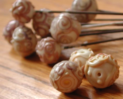
Silver ink stringer on ivory. Note the differential striking of the scrollwork (stringer) on the bead in the lower right corner.
This color comes the closest I've seen to a soft-glass offering of Northstar's Caramel and Butterscotch, which in turn are somewhat analogous to Glass Alchemy's Silver Strike III & V, those wonderful creams-to-browns with violets appearing in the worked areas. I suspect these glasses are more-or-less opaque versions of amber-purple, that fabulous class of borosilicate glasses that provides so many alluring color variations, depending upon flame chemistry.
Last Gathering I saw a strand of beads that beautifully illustrated amber-purple's characteristics: they shaded from a lovely dark amber, thru orangey reds, into deep garnets till finally very rich blue violets. The artist, Jesse Kohl, was the Northstar rep, and he spent hours attempting to educate me about borocolor chemistry in general and amber-purple in particular. As I understand it, the color comes from silver (hardly surprising, given the whole subset of beadmakers who pursue this metal's effect on their beads, not to mention the GA name and, er, the Effetre name for that matter) but is moderated by gadolinium, which makes great purples, fuscias and reds but unfortunately costs about a thousand dollars a KG. Amber-purples as a class are striking reducing colors, so of course one creates the item in a pretty strongly oxidizing flame to ‘burn off the haze’, then lets it cool, then ...I still can't strike this color reliably. But one fact that I did take away from the demo is the importance of letting the bead cool.
In order for amber-purple to strike, one must be patient, and wait. In fact, for awhile my hottest selling item was a butterscotch bead with a gold surface tone. I made a bunch, sold ’em, got orders for more, knew I hadn't done anything particularly special to get the effect, made more, couldn't get the effect no matter what I did, was ready to pull my hair (or worse, cancel the order and lose the money) when I accidentally just waved the bead around and let it cool—and there was my bronze-gold surface.
Duh.
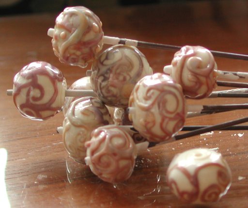
I'm a slow learner, but eventually, after making enough of the beads pictured above, it occurred to me to once again try this trick: make the bead. Let it cool until the colors show. Then put it in the kiln.
Silver pink curliQs on ivory.
The beads shown on this page are hollow ivory (don't recall whether dark or light) with silver pink trailing. (I had a bunch of unlabeled stringers made of silver pink and opal yellow; the opal yellow strikes to sort of a brown, as far as I can tell, though I didn't realize that till after I'd taken this photo; the silver pink does the pink/purple thing.) I still can't tell you how to get purple rather than pink, except to suggest that in amber-purple, you get it by repeated heat-cool iterations, and I note in my own beads the most worked areas tend to be the bluest.
I check to see if my bead is cool enough by closing my eyes and holding it near my cheek, which actually feels nice because I'm too cheap to turn on the electric heater and the 2 16x20 vents to the unheated garage that serve as my fresh air intake means that in the 30–40 degree temperatures we've been experiencing the studio is cold. Am I recommending you hold a piece of glass some 900 degrees F. near your face? With your eyes closed, no less? No. Let me repeat that again: NO! Just because I'm stupid doesn't mean you have to be. However, the point is that if you immediately put your bead into a heated to annealing temp kiln (or even the 890F mine's typically at) your bead likely will not strike. Obviously, you don't want your bead to get so cold it cracks (less of a problem for hollows anyway) and for me the radiant heat provides a handy indicator for when I should expect the color to start showing (when I no longer feel heat pouring off the bead.)
So there it is: 900 words to tell you to try letting your bead cool a bit. Aggravating, isn't it? No? You enjoy this kind of fiddling around? Well, have I got the glass for you....
A big thanks goes to all the people who have shared their tips and tricks in general, and to Jesse Kohl in particular. Maybe I didn't learn very much, but I surely appreciated the effort.
Post created 22may2004 (or before); captions added 26apr14 (to fix the formatting.)
Unless otherwise noted, text, image and objects depicted therein copyright 1996--present sylvus tarn.