I don't usually show the letters that go with the envelope decorations, not only because they're personal, but also—frankly—because they're likely to be very dull for a wider audience: it amazes me that the recipients don't find them incredibly boring, honestly.
page of a letter, April 2023. As above, now with calligraphy/letter writing:)
But this one has some fun, glass-related decorations to go with an excerpt I left unredacted about tidying up my glass studio that could at least marginally be argued as an interesting window on my working methods, which have always relied heavily upon organization—if I can't find it, I can't make art with it!
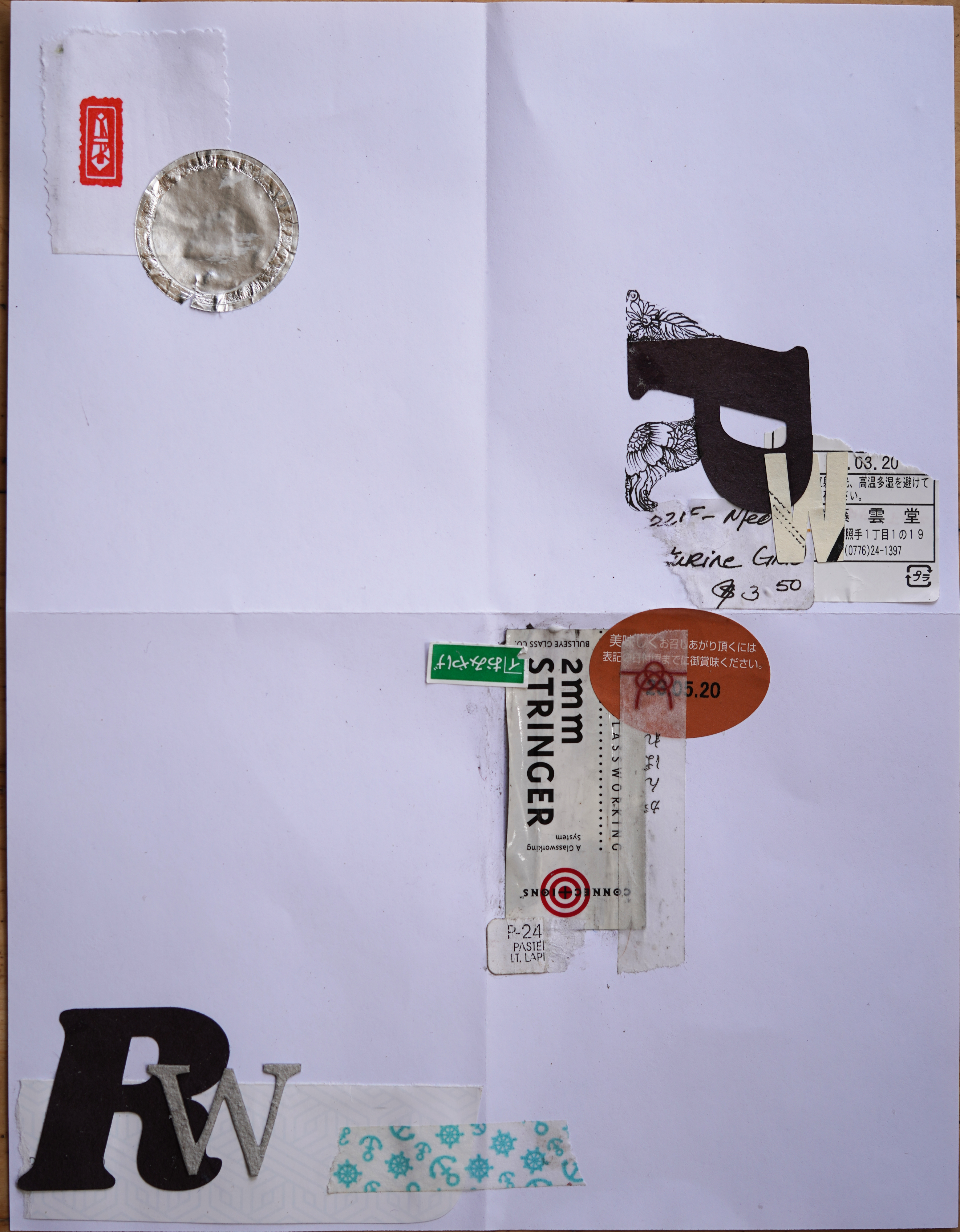
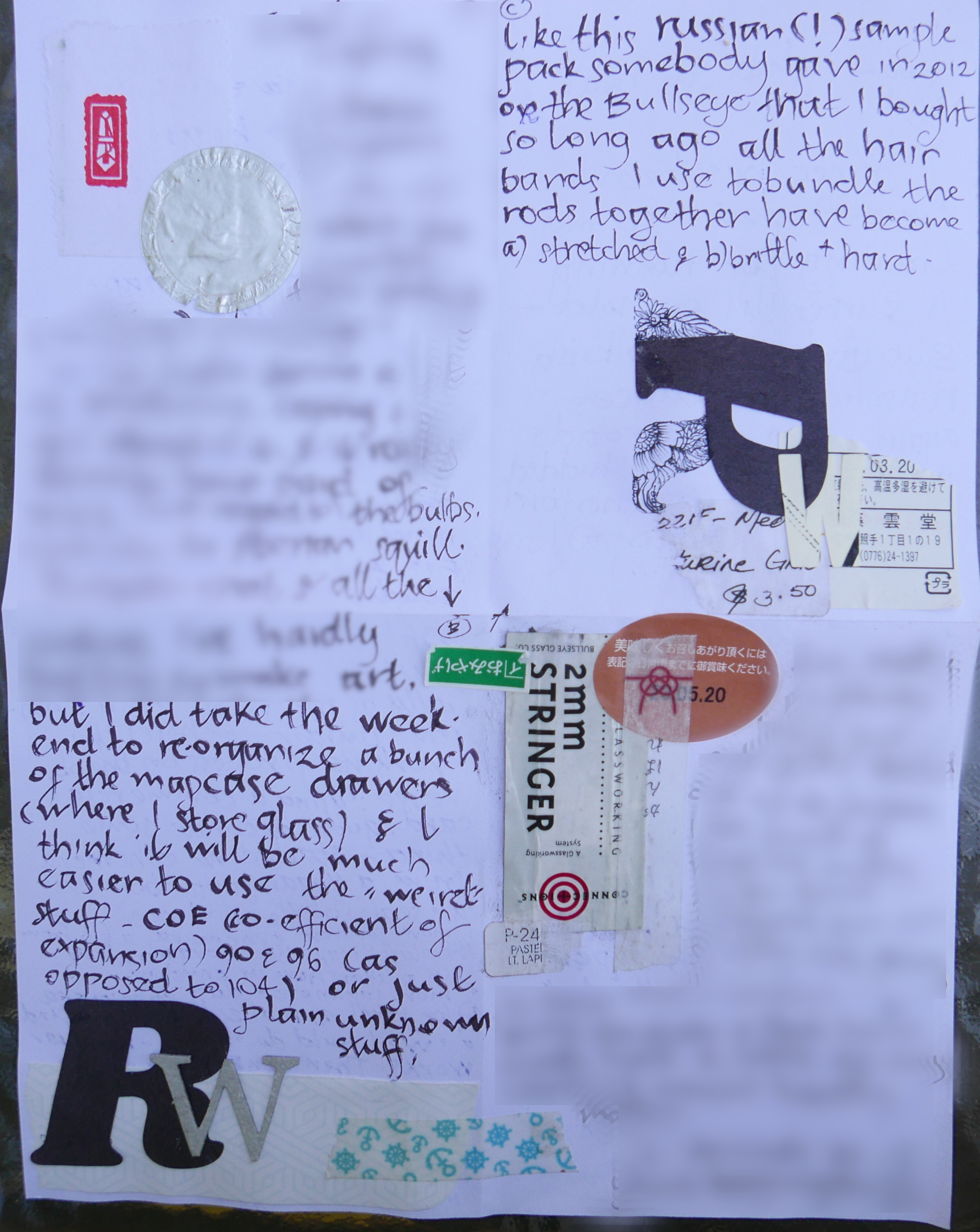
Here's the stationery, ready to go: Commercial scrapbooking letterforms, bottle cap liner(?) bullseye glass labels, handmade glass label, Japanese ephemera, white glue, washi tape, & technical pens; Cropped, scaled & lightened in gimp
(My usual trick is to show the blank version, but I didn't find pix of that until after I'd already made the page, so...I just added it in a day later:)
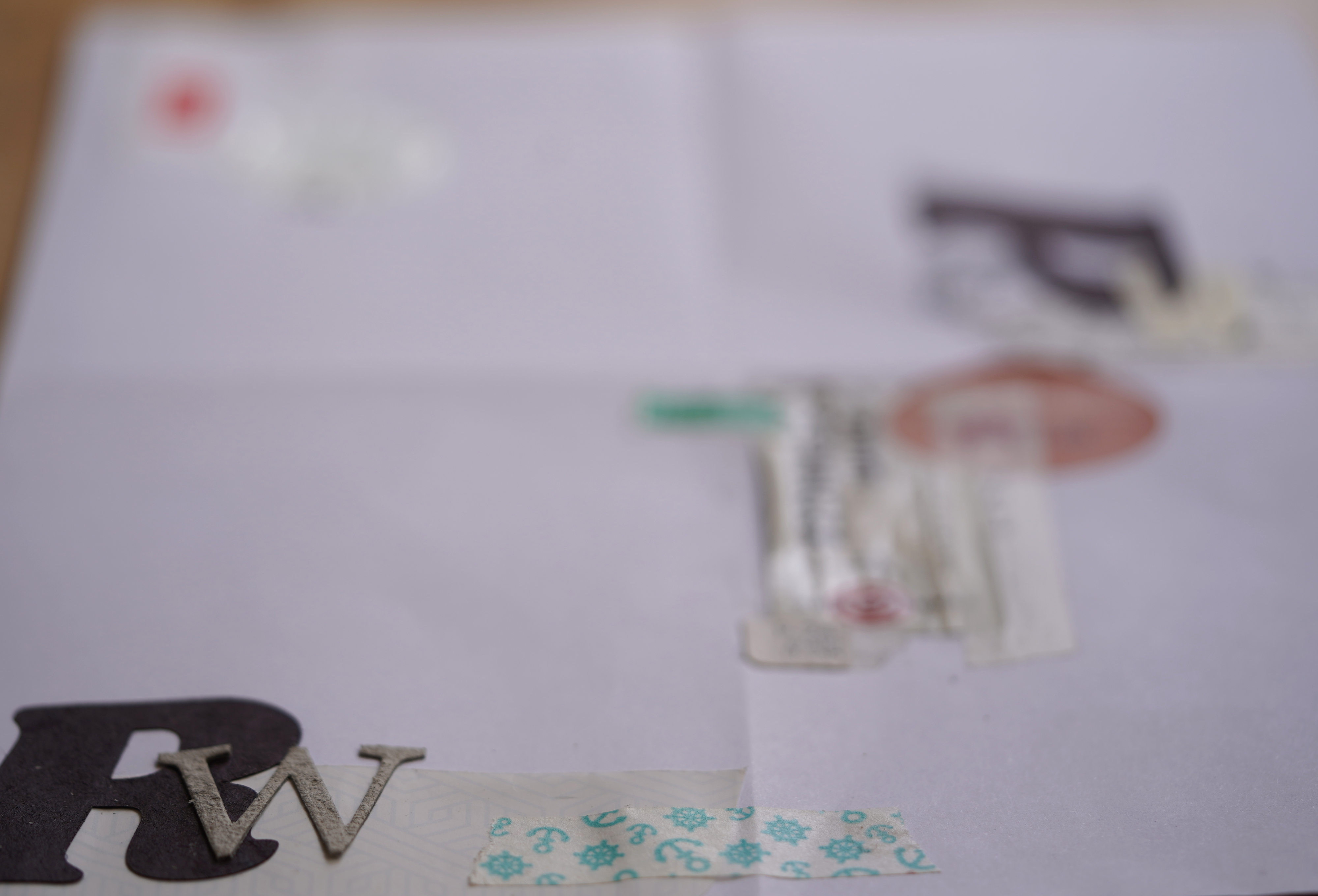
Angled shot, showing off the texture (thickness) of some letterforms. Obviously it's easier to have some thickness to components safely tucked into an envelope, as opposed to the outside where postal machinery can rip it off, or worse, crunch the letter. Even so, I split the thickness of the ’W’, using the bottom layer because I liked the felty texture of the interior of the cardboard
The recipient gave me the scrapbooking letterforms, and I selected ones I could make into the initials of my company name, Rejiquar Works. Since I couldn't find two ‘R's’, I tore a bit off a ‘P’ to make it a little less obvious that I was adding floral decorations to compensate, but I kind of like my solution:) As it's easier to have some thickness to components safely tucked into an envelope, as opposed to the outside where postal machinery can rip it off, or worse, crunch the letter I felt free to use a cardboard punched ‘W’, but even so, I split the thickness, using the bottom layer because I liked the felty texture of the interior of the cardboard.
The nautically themed washi tape is a throwback to earlier letters and a shared history of childhood sailing.
assorted ephemera, including text from an old French textbook and discarded cards.
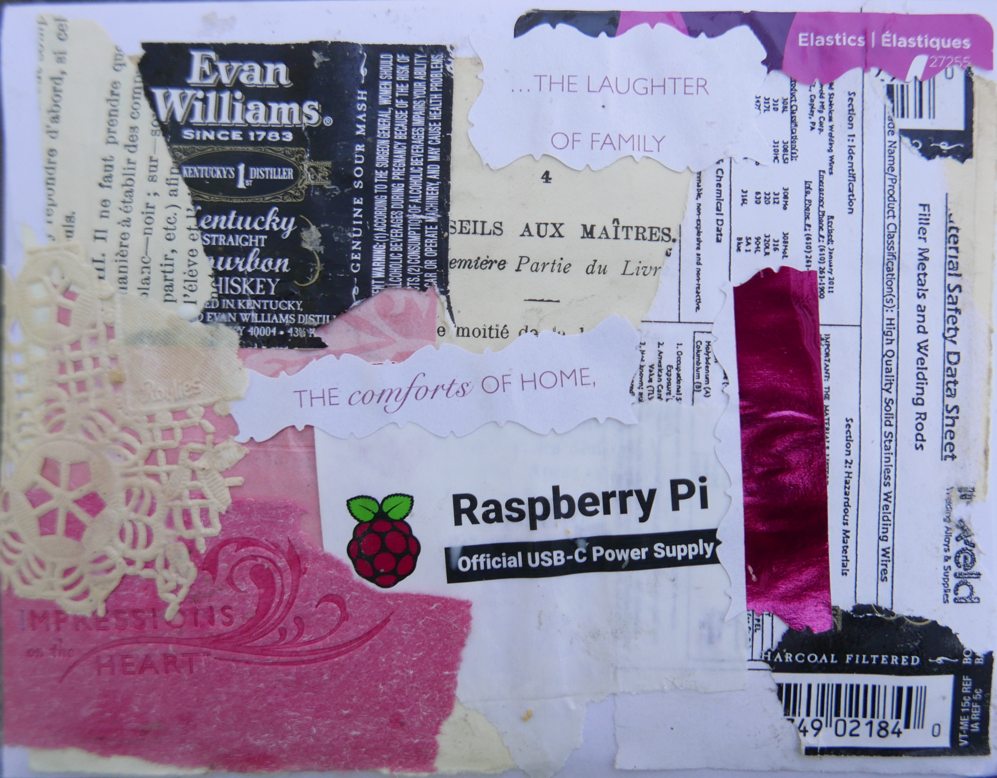
The envelope back only loosely ties in: the commercial sappy reasonably authentic if rather anodyne sentiments ("impressions from the heart" & "the comforts at home")[1] were ones that I could incorporate on both sincere and rather ironic levels—they're commercial, but not-purpose-purchased as the initials on the letter page were.
More, ahem, authentic is the welding rod safety data sheet (from the wizard, though beadmaking mandrels are, in fact typically either 308 or 316 stainless steel welding rods, and he and I can use them interchangeably in our pursuits;) and the packaging for hair elastics, which I used to bundle rods during the mapcase glass reorganization referenced in the letter above.[2] Stretching a bit, the wizard also replaced my old clock radio display with a new one controlled...by some sort of raspberry pi- ish type electronics.[3]
But really, I was just pulling in pinks to match. The booze label, (carefully and kindly removed for me by the wizard, who has gotten really good at this) paper lace and french text form a secondary theme, old cool-looking stuff. Sometimes, I just put things in because I think they're handsome. Or because people gave them to me, and I appreciate that.
UPDATE: 22jul23: found & updated page with images of the blank stationery and wrote a bit about them:)
[1]Certainly the recipient's home is a far more welcoming and gracious space than my own: interior design is a real art, and the people with a gift for it often don't seem to realize how much talent and effort it requires.
[2]I like using hair ties because they don't stick to the glass when they inevitably oxidize and wear out...
[3]I haven't used either the radio or its alarm, which dates back to my teenaged? years for anything except a timer while doing production beadwork, or to note when a lampworking session finished, for decades —it's not energy efficient but I liked that the old clock radio and kiln controller display matched.
Unless otherwise noted, text, image and objects depicted therein copyright 1996--present sylvus tarn.