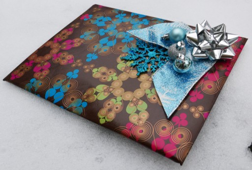
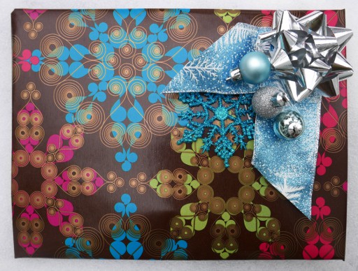
Page and F2tE share a love of interior design, gothic ambience, and doll houses they are slowly restoring and decorating. I'm sure those factors played in the choice of this paper, which was used to wrap dollhouse decorating elements.
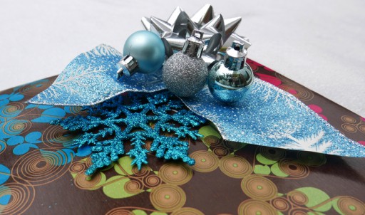
I found the silver sky blue a striking and unusual contrast—a really effective choice I never would've considered. Earth tones are an unusual choice for Page, and it's not surprising that this brown paper incorporates her beloved jewel tones—rich, saturated pure hues in the cool range. Plus, of course, the elegance of metallics—note how she's contrasted the low-gloss old-gold accents in the paper with the bright silver, somewhat softened with the matte elements. Page has a deep love of matte surfaces, very much in evidence here.
The wizard didn't like it at all[1] , which just goes to show that colour combos definitely have a personal element to them—no matter how gifted (ahem) your abilities, someone will hate it!

Another view of the gift. All three images have been image edited, mostly cropping, perspective & colour adjustment.
This is particularly true of more daring experiments; but I'd rather see someone go on a limb than stay safely in the bland and boring. Whatever you can say about this giftwrap, it's not boring!
[1]Good thing it wasn't for him—he liked his much better;)
Unless otherwise noted, text, image and objects depicted therein copyright 1996--present sylvus tarn.
Sylvus Tarn
