Our guild has been doing bead challenges (in fact, I'm the co-ordinator) for 2013. The March challenge was ‘analogous color schemes’ —the “40 shades of green”. Some people chose to interpret this in shamrocks, but I was too lazy to draw those on the breasts of my birds (though I'm certain it would've been excellent training and continuation of the feb hearts, seeing as shamrocks are basically 4 hearts, radially rotated around the point of the heart...c'est la vie)
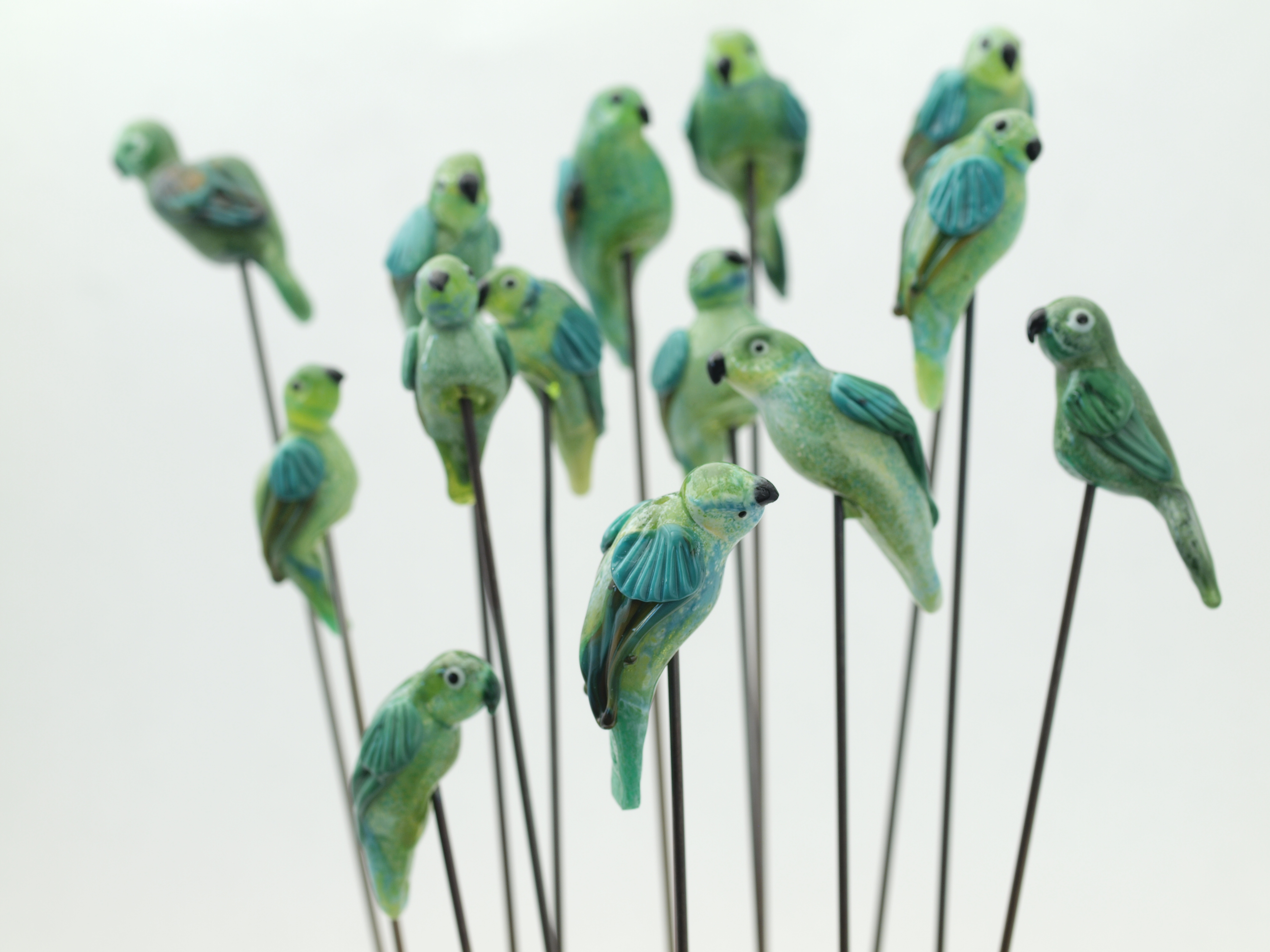
Green glass parrots. Built on a 022 hollow base, with white, seafoam opq green TE, transparent yellow-green and turquoise TE, apple or dark TE (top of head) and, in the later birds[1] , mosaic and petrol opq greens for the wings.
When I did the pink birds for the feb challenge[2] I didn't worry too much about consistancy, because I was still relatively low on the learning curve, and I wanted to experiment—which was very helpful, because just by playing around I “discovered” a lot of basic bird shapes.
Now that I was becoming somewhat comfortable making bird beads, for March I wanted to see if I could create something more consistent: in this case, a parrot. Why parrots? Well, for one thing, birds in this family do actually come in green. Another reason is that pirates and leprechauns are associated with gold, and the mythology of my head, both are also ‘trickster’ characters. So it's not altogether surprising that I kind of merged them mentally.
Hence the iconography.
My earliest efforts were pretty bland, colorwise, because I only used green: a mistake. When I wrote out the challenge (see below, if you'd like to try it as an exercise yourself) I discussed how one can visually mix yellow and blue to get green—something that works a lot better in glass than, say, paint, where you get this rather muddy olive green, because the glass will actually liven up the color when you case a transparent aqua over yellow.[3]
So, first thing I decided to do, because I liked it in the pink birds, so well that I continued to use this trick for all the birds I'd made since was to lay down opaque white, emphasizing the underside (with the blue-gray-green on top); then I rolled the bead in the trans yellow green and aqua to liven things up. This, I felt, really helped. The mosaic green wasn't really as dark as I wanted, pulled thin, so I used hades, which at least used to be a green black. The eyes are that super-light pale opaque green, which of course basically reads as white, given the contrast of the black.
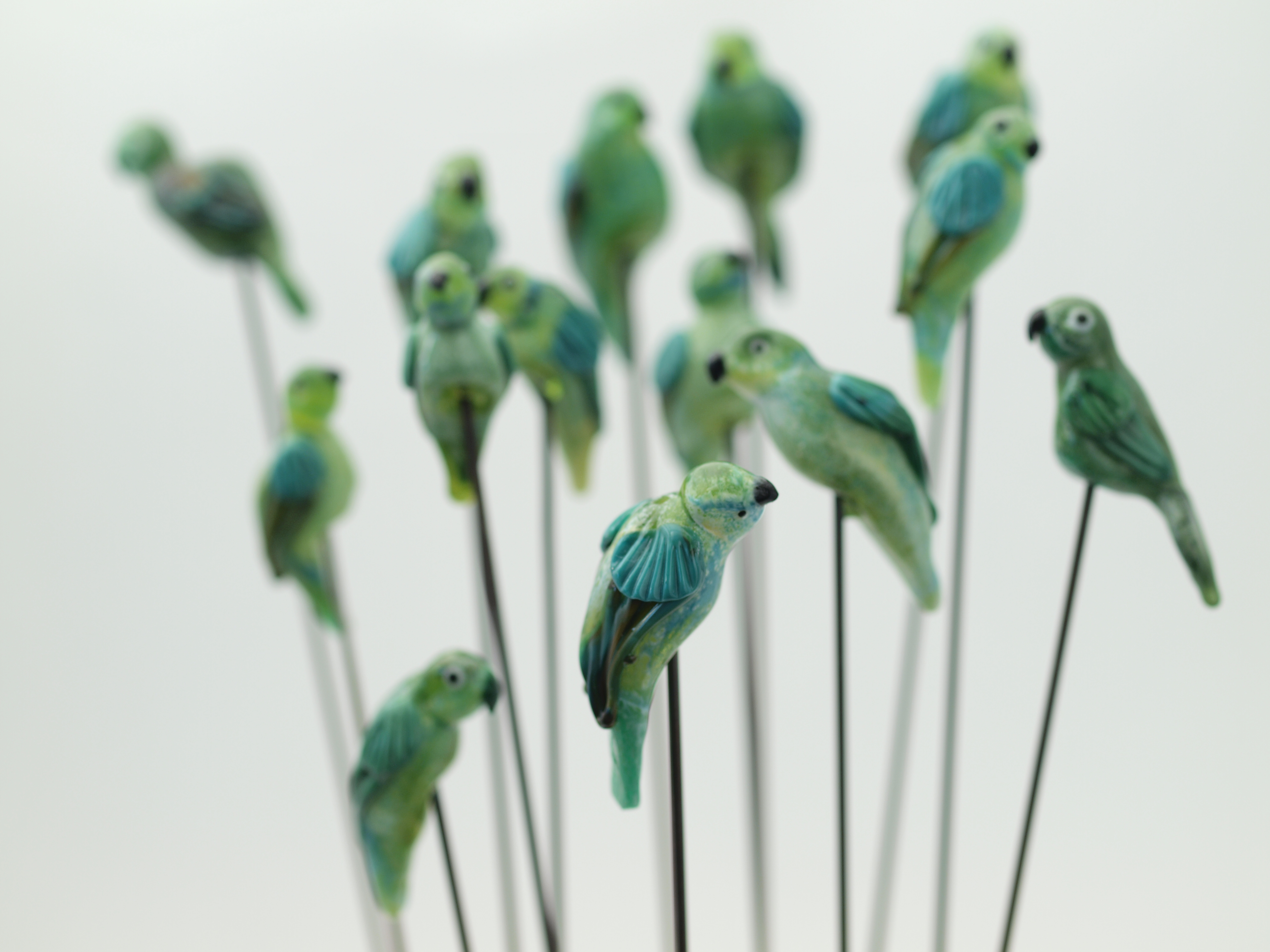
Same basic photo, but with a reduced DOF to pop the bird in the foreground. There was no way I could position the birds flat on the background paper, so I hit upon positioning them on mandrels stuck in sand: because the beads were hollow, I could angle them on the mandrel a little.
My head to body ratios tended to bounce all over the place, and one early, serendipitous bird had a very fun cocked head (that's the one at the front of the photo) so I tried to replicate it, with varying degrees of success. Overall, most of the birds looked more-or-less parrot like, though at least one ended up resembling a dove.
But there was some progress, and I did get better at making birds. —Just yesterday, I was flipping through an old Flow magazine,[4] which has a Kim Fields tut on green lovebirds (which are small parrots), and it was kind of interesting to see how her approach paralleled mine, given that, although I'd seen her do a bird demo, one reason I picked parrots, besides the ones listed above, was that I thought they had a distinct silhouette that would be fairly easy to capture, and also that she hadn't demoed this particular bird, or put one on her poster.
So I thought I was being original.
Ah well:)
How are you doing with the March bead challenge? Are you exploring lots of fun new ways of playing with a limited palette (greens)? I mentioned some of this during the meeting, but those of you who didn't make it, here's a summary:
MARCH CHALLENGE—Greens: analogous color scheme
An analogous color scheme is one that centers on adjacent colors—in this case, the classic emerald or kelly (think petroleum) green associated with St Patrick's Day. Ireland is famous for its ‘40 shades of green’, and this is what I'd like you to explore.
RULES:
Make 12 beads, as similar as you can, all in a GREEN color scheme.
If making pendants/using leaf, use gold/gold fill (pot o’ gold and all that, right? Not to mention yellow is a component of green)
The usual about annealing, lack o’ cracks, bead release, etc apply.
NEW!!! Bring a business card or slip of paper with your name FOR EACH BEAD. IF you can, put them together in a small transparent (because yes, I know y'all are wonderful, but I still need to do quality control) bag. This will make assembling the lots much faster, and means you get your beads at the meeting!
Suggestions—
Note that you do not necessarily have to use only green glass: Kristina Logan's favorite green bead with cobalt blue dots is actually acid yellow cased in transparent dark aquamarine, which gives a rich, brilliant green. For those of you wanting to push the boundaries (particularly contrast) recall that hades (at least when I last tested it) is a green black; and there are some opaque greens so light they look nearly white. My beloved Mosaic green also will read very dark (depending on flame chemistry).
So there are plenty of options for value. There are also lots for hue—if you're wanting an excuse to buy glass, Frantz has lots of intriguing looking greens. But even just playing with the basics—the yellow pea to the bluish petroleum—there's still a huge range.
You can also continue to explore the transparent-opaque theme we had for the January challenge—now with a little more complexity if you like, since ‘green’ is a much wider visual range than white.
There are a couple of reasons for this—one is that though most people think of green as a secondary color (blue plus yellow) which it is indeed in a subtractive context (i.e., with pigments); but from an additive one (your monitor or the sun) it's one of the three primaries, along with red and blue. This is true for the light sensing cones in your eyes, as well: each of the three types in typical vision respond most strongly to a particular wavelength of light—red, green, blue, which green being smack in the middle of the ‘visible spectrum’.
Thus, your perception of color is ‘trichromant’ —it's your optic nerve and brain that takes those three sets of responses, and processes them into the 10 million or so we ‘perceive’. (Other animals see further into the infra red or ultra-violet, and some can perceive polarization directly—very handy for detecting strain in glass!—and a very few people are thought to be ‘tetrachromant’ as well—Claude Monet, for example.)
For this reason, people's response to, and categorization of, color can be and is socially mediated: that is, people growing up in different cultures really do perceive green differently! There was a quite fascinating study comparing western researchers’ ability to discriminate color with that of some tribe or other. They could see a yellowish-green we had a difficult time picking out; conversely, we were more sensitive to turquoise (iirc—and I'm simplifying greatly, here. And yes, as an artist, I was able to see what they saw, though I had to work a little harder.)
Basically, I'm trying to get you to think about greens besides what we culturally define it as—that kelly green associated with St Patty's. How do you think about green? How far do you push it before it becomes ‘yellow’ or ‘blue’? (Hint: what you put beside a color can really change its profile. That's the whole basis of those Joseph Albers concentric square paintings, indeed the whole ‘Color Field’ movement of the 60s.)
Play and find out!
(For those wanting yet moar freedom, you can put gold leaf or gold pixie dust on your beads as an alternate—again, entirely appropriate, given the holiday, what with leprechauns and all. And if color-color-color is your thing, just be patient, the floral challenge is coming up in May, you'll have your chance then.)
APRIL: bunnies. Bunnies are a fun way to explore sculptural glass. —I'll have a tutorial of not one but two easy methods to make this quintessential easter symbol to hand out at the next meeting for those a little nervous.
MAY: florals. I'll be demonstrating both floral and leaf canes for this one. I also have a tut on my site showing a simple method for making flowers with dots if trailing with cane doesn't float your boat.
Melt some glass,
sylvus
[1]Earlier birds featured a custom cane with an acid yellow core, some sort of opaque green and dark aqua trans, which I've mercifully forgotten the details of, because when I used the cane, I got this nasty sulfur reaction. Bleccch.
[2]Actually, they were a bonus bead, to entice people into participating/not minding that I couldn't hand them their beads that month
[3]As long as you do it carefully; otherwise, that dratted sulfur reaction pops up...
[4]I know I've read this issue, too, though it was the shell demo I explicitly remembered, since a friend was interested in that particular tut.
Unless otherwise noted, text, image and objects depicted therein copyright 1996--present sylvus tarn.